


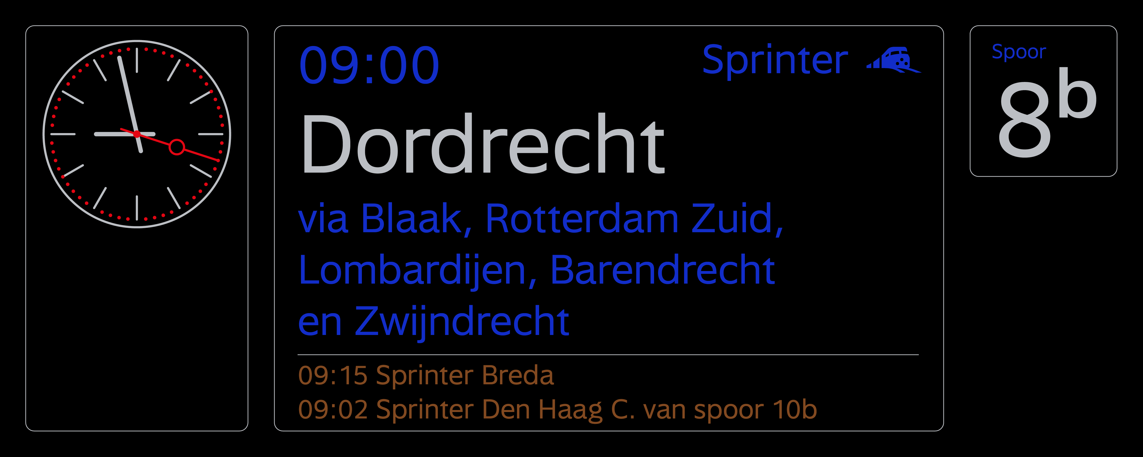

Saltburn is a functional railway inspired variable text-face, carefully designed for track and rail. From the outset, inspiration was drawn from the British interpretation of the sans serif model and its use within transport systems. Edward Johnston’s Underground Alphabet (1916) and Eric Gill’s subsequent Gill Sans (1928) encapsulated a uniquely British take on the sans serif, one that was more humanist in tone than the geometrically pure style developing on the continent. Being stationed in Rotterdam and half Dutch myself, I had also always held a soft spot for the Dutch National Railway or the ’NS’ (Nederlandse Spoorwegen) – bright, pragmatic, rational and consistent in regard to its corporate identity, set forward by Gert Dumbar whilst working for Tel Design in 1968. Maybe there’s also a pinch of jealously thrown in too, considering British Rail was privatised in 1997 before I could remember.
After a bit of digging, I leant that the Dutch NS initially employed Adrian Frutiger’s Univers typeface but made a switch over to an adaptation of the Frutiger typeface in 1995. Gerard Unger had been commissioned to design this adaptation specific to the requirements of the NS in cooperation with Hans van Leeuwen from Visualogik. This adaptation which had so intrigued me, was dubbed NS Sans with special versions created for different applications; NS Sign for signage and NS Card for on-screen application. I can imagine one reason for the switch lay in the increased legibility achieved by Frutiger’s humanist open contours; arguably crucial for reading at a distance amongst the bustling chaos of rush-hour.
A further point which helped me galvanise Saltburn’s direction was observing the clear visual link between various ‘double arrow’ symbols used by different national railway networks. British Rail, the Dutch NS and the Swiss Federal railways (SBB) all developed relatively similar symbols of two arrows pointing in opposite directions. It sheds light on a specific period of time in which the international ‘house style’ was ubiquitous across transport and industry; a standard we still see in use today. However on reflection, I noticed a drop of irony and humour within this: That by employing a neutral style for a national network, you inevitably missed out on the unique and diverse character that a nation may have. This thinking inevitably led me to imagine Saltburn to blend into this ‘railway style’ adopted by nationalised networks, designed for a speculative network of its own. Upon establishing this direction, the floundering subsided and the wheels of production began buffeting down track!
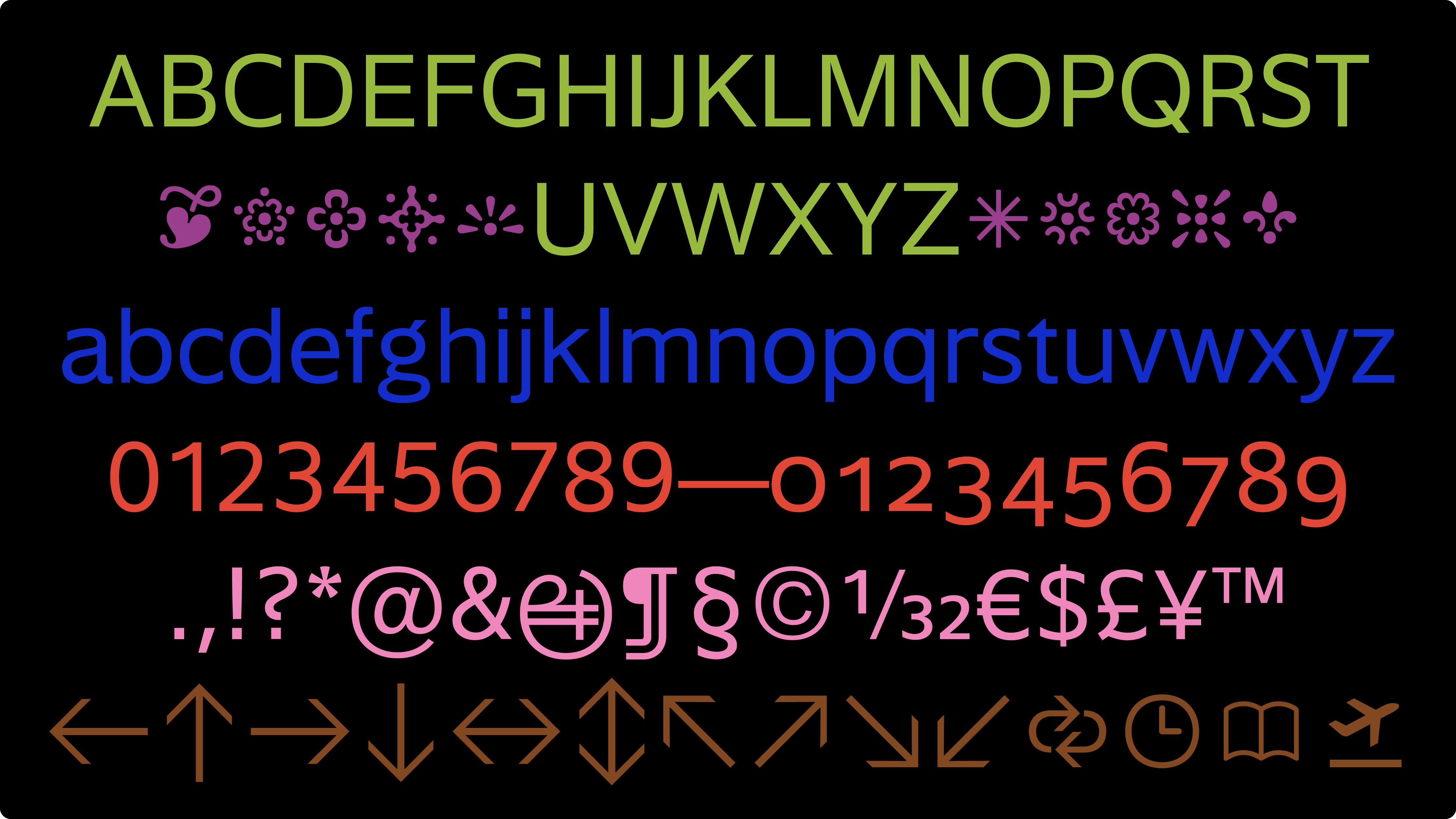
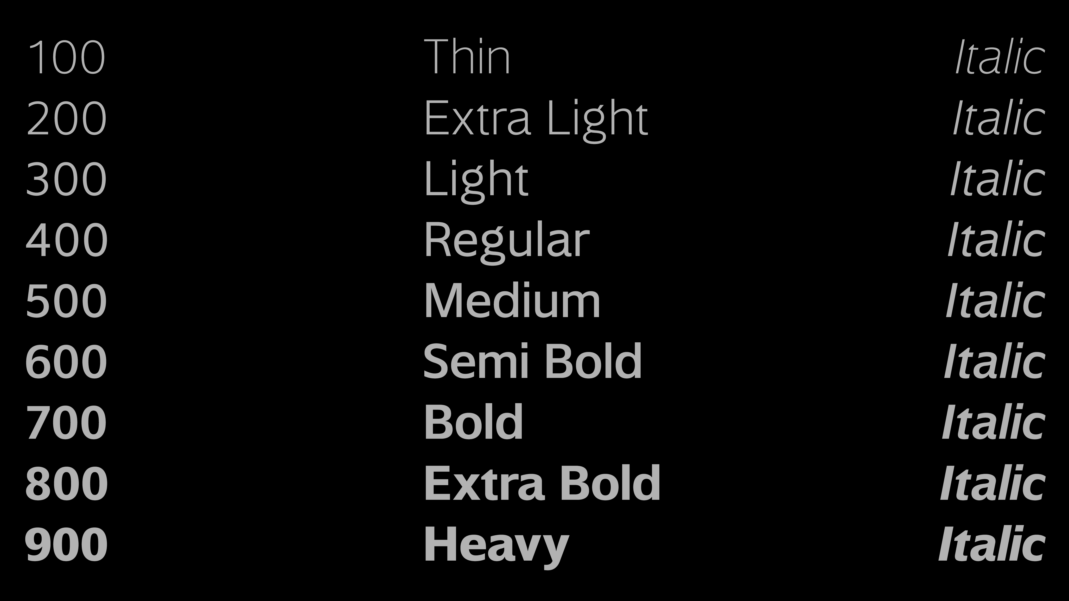
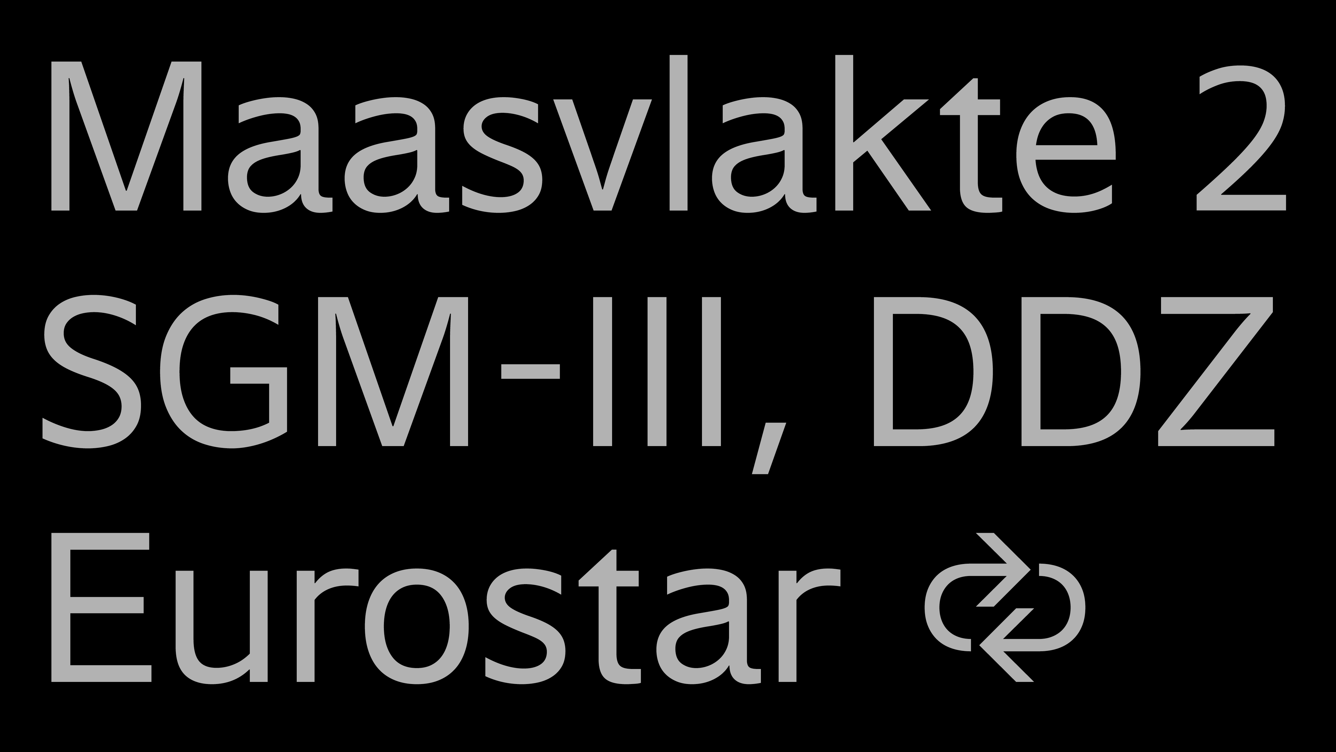
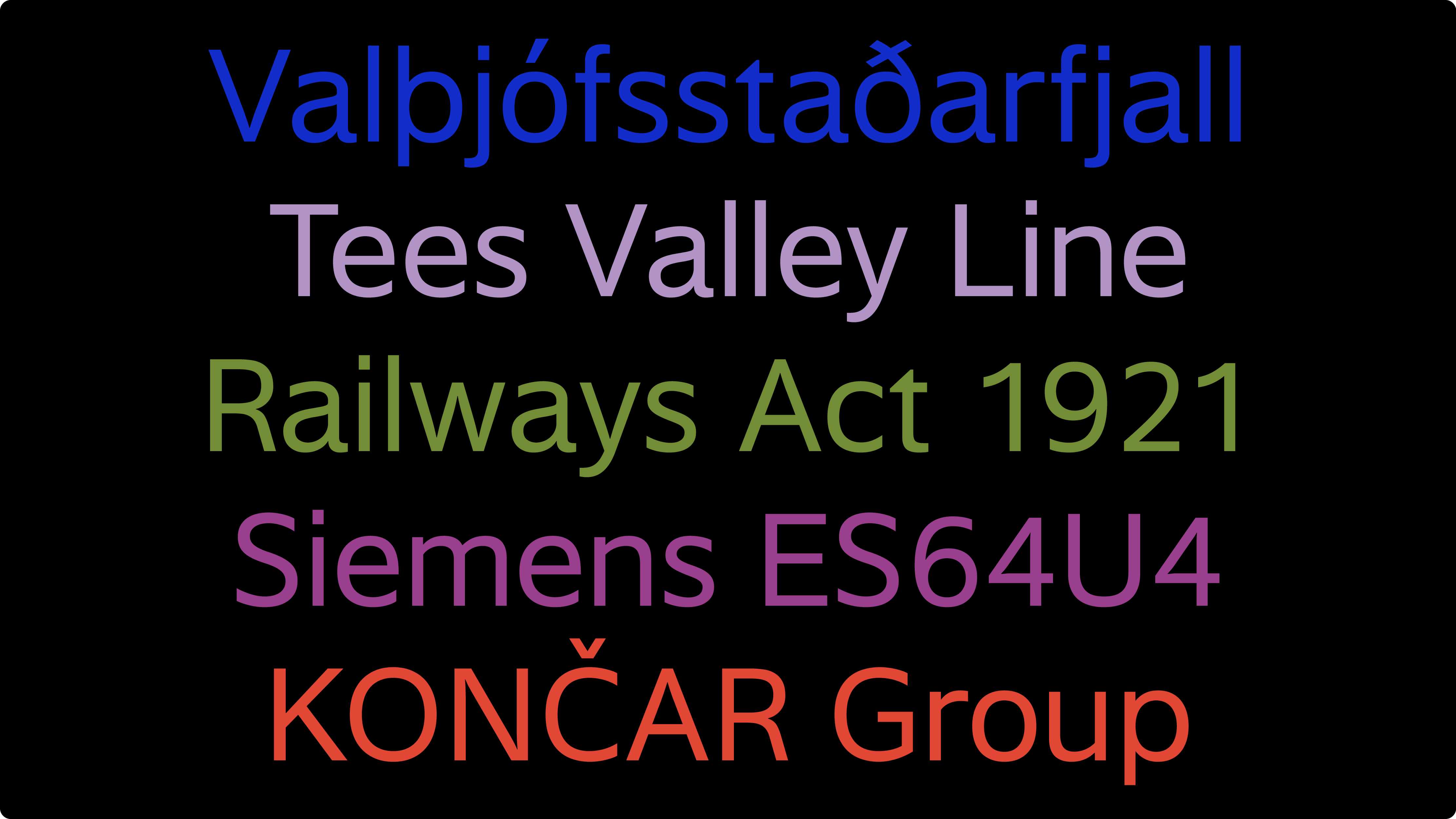
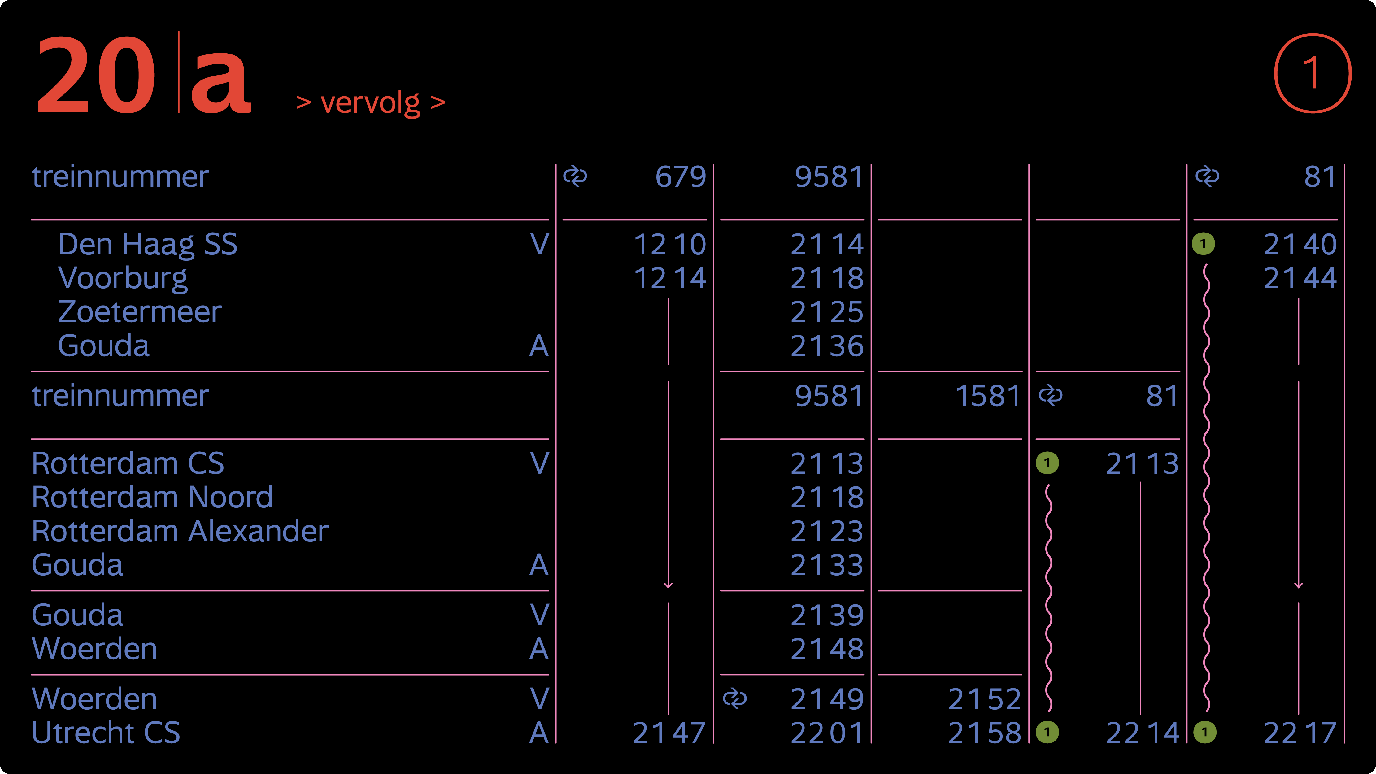
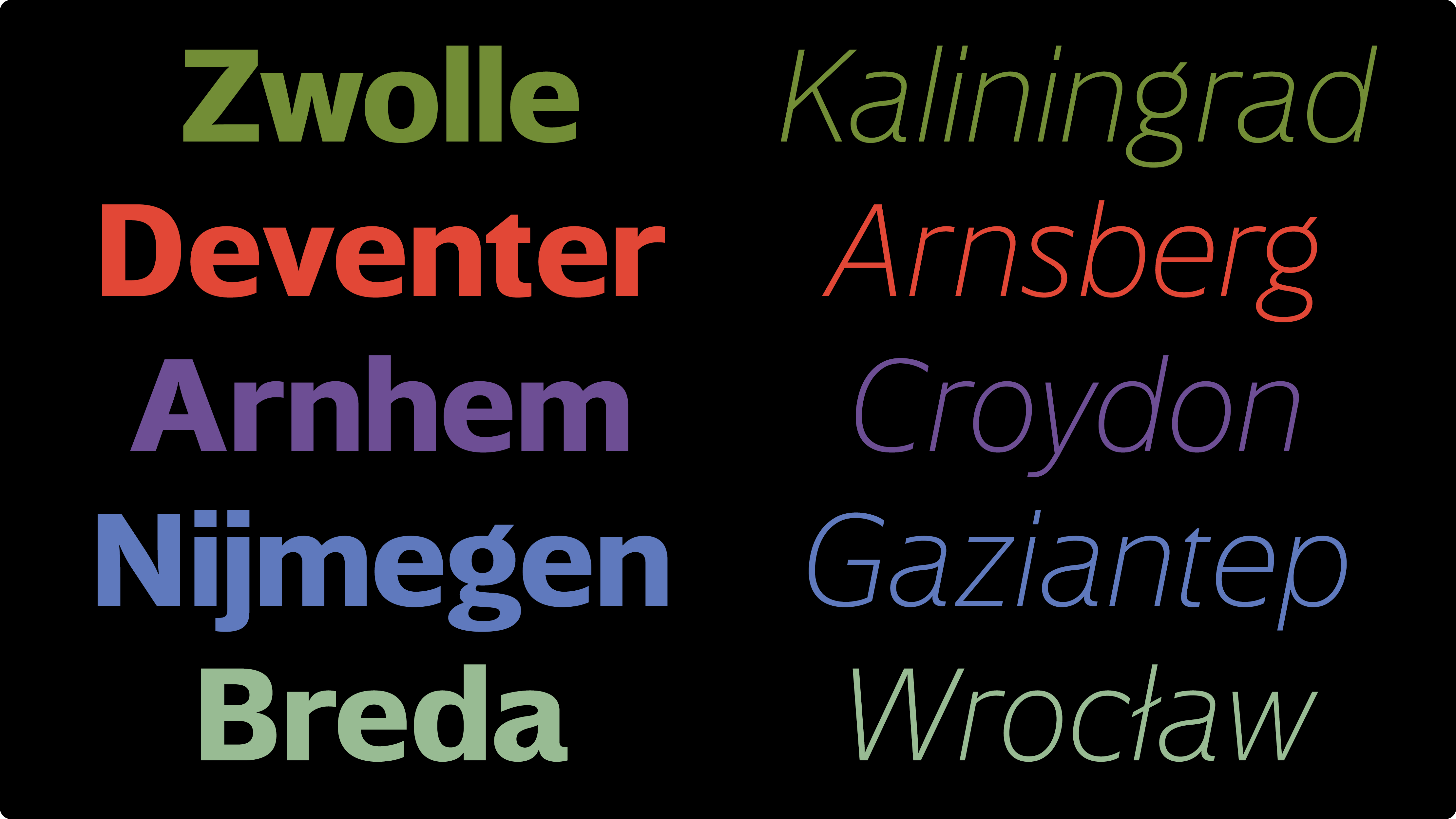
Saltburn was designed as a variable font which dictated a few aspects to ensure it could smoothly interpolate between its parameters. Open counters were developed to increase legibility at distance and within text, achieving a lightness of colour. The default character set features a characterful double story ‘g’ and chiseled ’t’ as well as more standard alternatives depending on taste. Beside the extensive range of alternative glyphs, Saltburn offers a wide array of figures, fleurons, symbols and pictograms to increase the typographical options available. The typeface is also fairly economic in design, making efficient use of space without compromising legibility. It’s lightness of colour is in part due to it’s use of humanist open counters but also as a result of its high shoulders and sharp stem-connections which help pump more white space into the counters, allowing it to tame the inevitable spread of ink at small sizes. It can also comfortable tolerate glyph scaling of 97–103% without much problem. The family is offered in nine weights from Thin to Heavy, with a variable counterpart offering a customisable weight and italic axis, compatible in an increasing number of design programmes and software. Saltburn’s current glyph set covers an extended Latin unicode range, supporting 114 Latin languages.
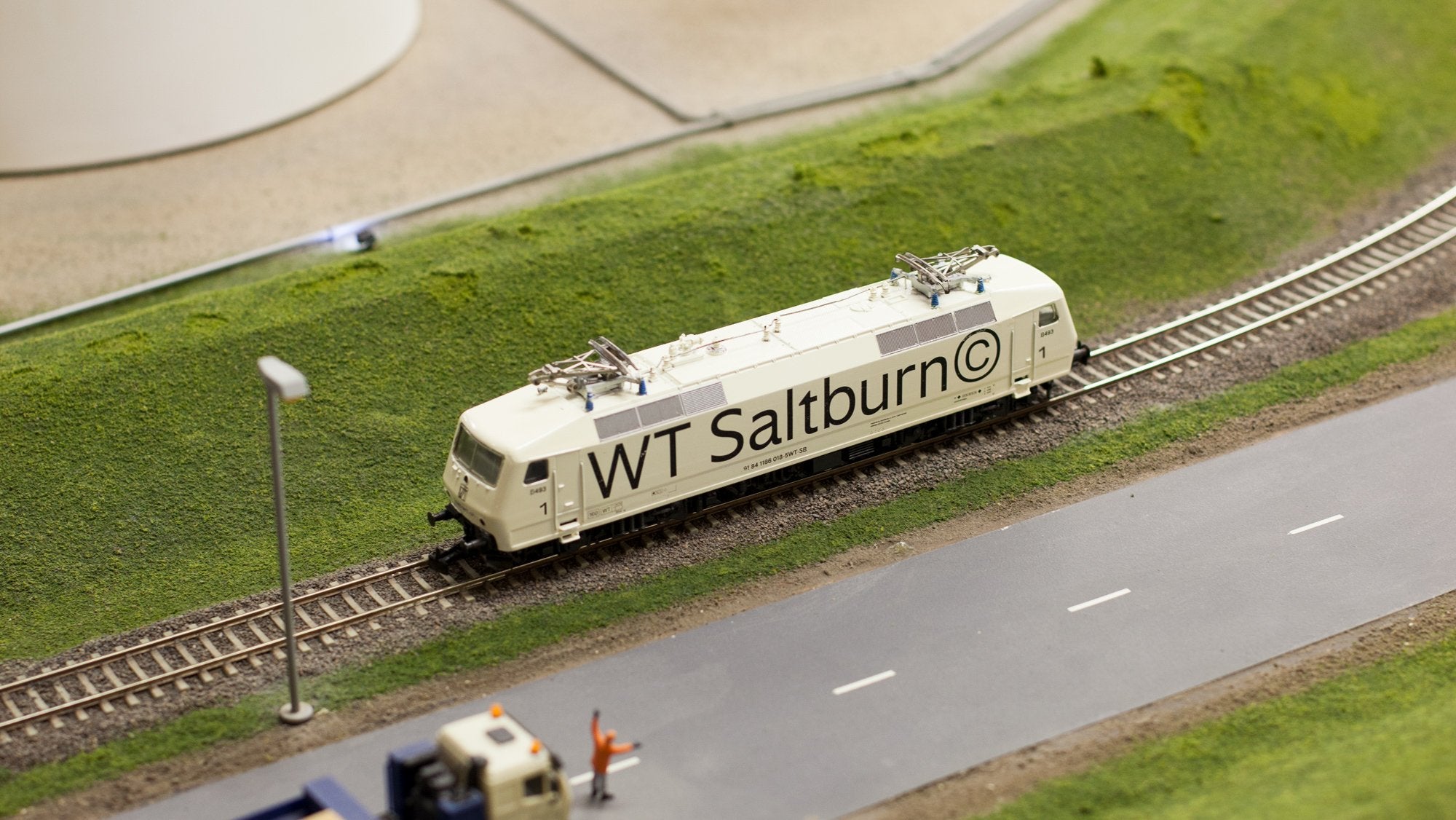
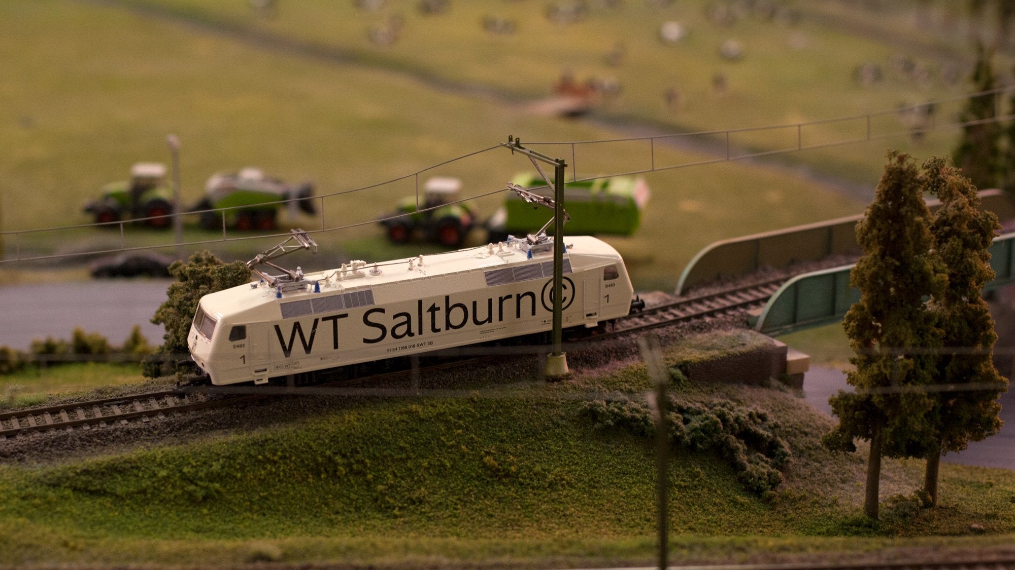
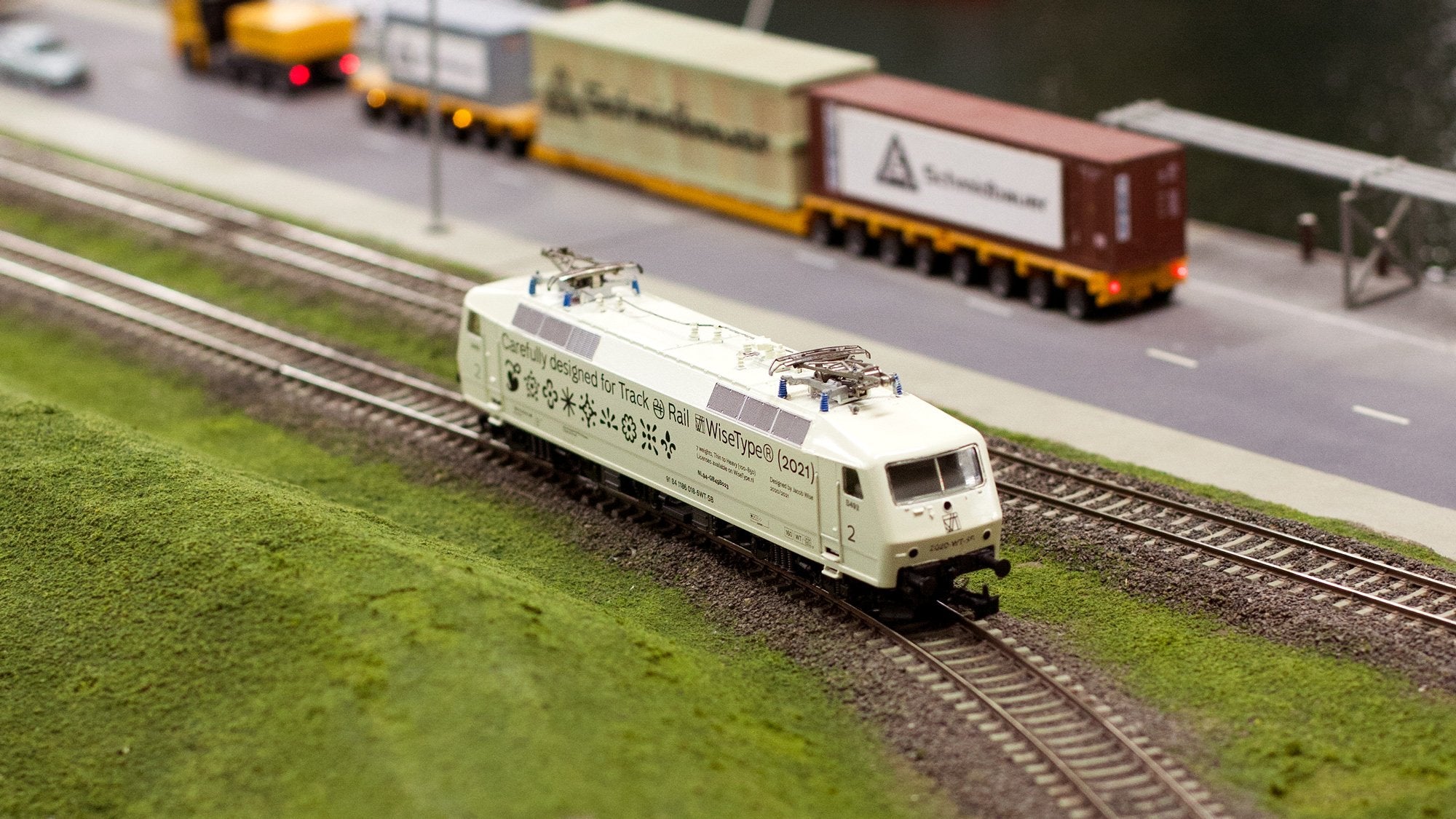
In an attempt to take Saltburn’s concept one step further, I decided to try think a little larger [or smaller] afield. This led me to the creation of my own scale model locomotive livery, botched together with a lick of paint and a sheet of custom water transfers. Chuffed with the result, I got in contact with Miniworld Rotterdam to see if they would allow me to photograph my locomotive within their scenery which they very kindly agreed to! So a big thank you is worth mentioning to Miniworld Rotterdam and the photographer Lorena van Bunningen for all the help.
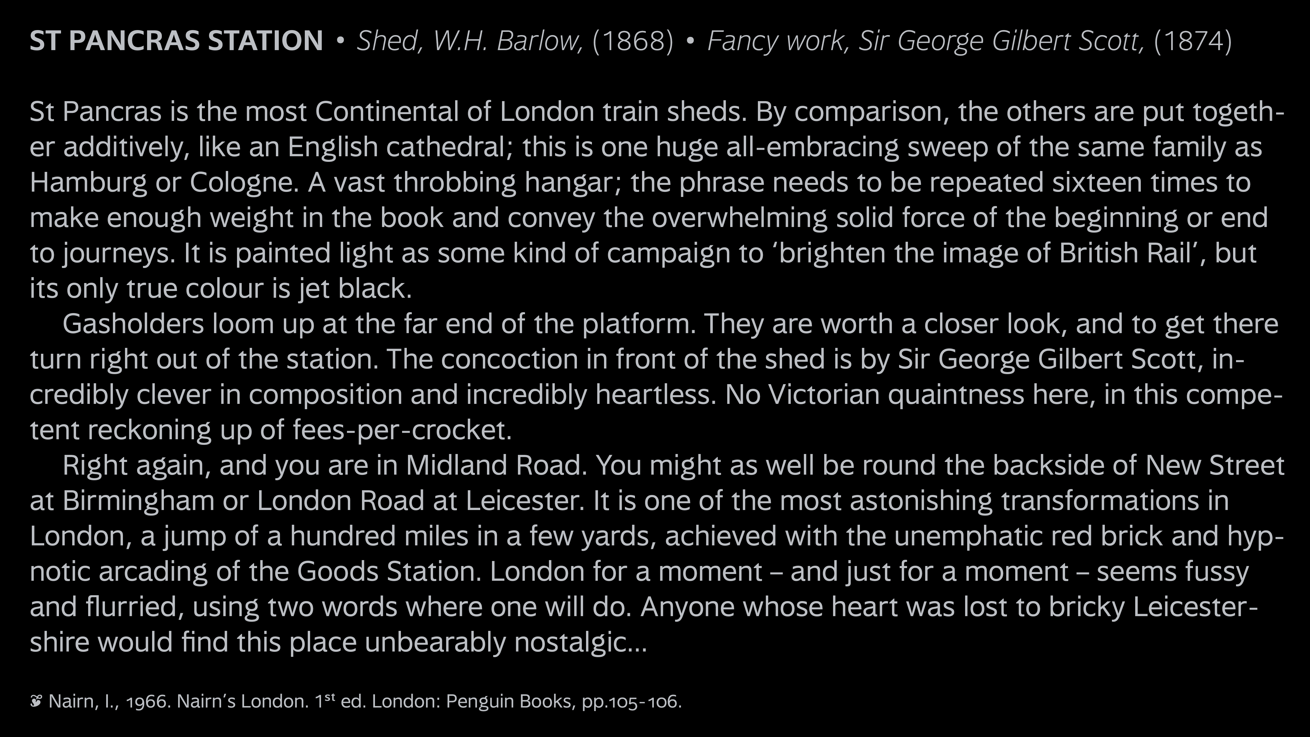
The name Saltburn is derived from Saltburn-by-the-sea; a relatively small sea-side town in the East riding of Yorkshire where my dad grew up. The town owes much of its very existence to the introduction of the Stockton & Darlington Railway which connected the small hamlet in 1861. Beside this, the town is also known for its picture-postcard funicular railway which has been transporting passengers up and down its steep cliffs since 1884.
Albanian
Asu
Basque
Bemba
Bena
Bosnian
Catalan
Cebuano
Chiga
Colognian
Cornish
Corsican
Croatian
Czech
Danish
Embu
English
Esperanto
Estonian
Faroese
Filipino
Finnish
French
Friulian
Galician
Ganda
German
Gusii
Hungarian
Icelandic
Ido
Inari Sami
Indonesian
Interlingua
Irish
Italian
Javanese
Jju
Jola-Fonyi
Kabuverdianu
Kalaallisut
Kalenjin
Kamba
Kikuyu
Kinyarwanda
Kurdish
Latvian
Lithuanian
Lojban
Low German
Lower Sorbian
Luo
Luxembourgish
Luyia
Machame
Makhuwa-Meetto
Makonde
Malagasy
Malay
Maltese
Manx
Maori
Meru
Morisyen
North Ndebele
Northern Sami
Northern Sotho
Norwegian Bokmål
Norwegian Nynorsk
Nyanja
Nyankole
Occitan
Old English
Oromo
Polish
Portuguese
Romanian
Romansh
Rombo
Rundi
Rwa
Samburu
Sango
Sangu
Sardinian
Scottish Gaelic
Sena
Shambala
Shona
Slovak
Slovenian
Soga
Somali
South Ndebele
Southern Sotho
Spanish
Swahili
Swati
Swedish
Swiss German
Taita
Taroko
Teso
Tsonga
Tswana
Turkmen
Upper Sorbian
Vunjo
Walloon
Walser
Wolof
Xhosa
Zulu
Stylistic Alternatives
Ligatures
Proportional Lining
Proportional Oldstyle
Tabular Figures
Case Sensitive Forms
Fractions
Slashed Zero
Numerator
Denominator
Superscript
Subscript
Scientific Inferiors
Ordinals
Ornaments
Localised Forms
Stylistic Set 01
Stylistic Set 02
Stylistic Set 03
Stylistic Set 04
Stylistic Set 05
Stylistic Set 06
854
2021
Lorena van Bunningen (Photography)
Miniworld Rotterdam
Céline Hurka
Hans van Leeuwen (Visualogik)
A
B
C
D
E
F
G
H
I
J
K
L
M
N
O
P
Q
R
S
T
U
V
W
X
Y
Z
a
b
c
d
e
f
g
h
i
j
k
l
m
n
o
p
q
r
s
t
u
v
w
x
y
z
0
0
1
2
3
4
5
6
7
8
9
0
0
1
2
3
4
5
6
7
8
9
!
?
.
,
:
;
…
&
&
§
¶
@
†
‡
(
)
[
]
〈
〉
/
\
{
}
¦
|
⟦
⟧
⸨
⸩
‽
¡
¿
_
•
⁖
⁘
⁙
⁚
⁛
⸪
⸫
⸬
⸭
‘
’
‚
“
”
„
"
'
‹
›
·
«
»
*
⁕
‒
–
—
-
⸺
€
£
$
¢
¥
₹
₤
₱
₧
₣
₿
ƒ
¤
1
2
3
4
5
6
7
8
9
0
+
−
×
÷
=
±
<
>
≤
≥
≠
¬
|
~
⁄
#
∂
∏
∑
Δ
Ω
ℓ
∕
∙
√
∞
∫
≈
μ
π
%
‰
⭠
⭡
⭢
⭣
⭤
⭥
⭦
⭧
⭨
⭩
⇐
⇒
©
®
℗
™
℮
◊
^
▲
▶
▼
◀
⯀
⯁
¼
½
¾
⅑
⅒
⅓
⅔
⅕
⅗
⅘
⅙
⅚
⅛
⅜
⅝
⅞
1/12
1/16
1/32
2/9
4/9
5/9
7/9
8/9
À
Á
Â
Ã
Ä
Å
Ā
Ă
Ą
Ǎ
Æ
Ǽ
Ǣ
Ć
Ĉ
Ç
Ċ
Ð
Đ
Ď
È
É
Ê
Ë
Ē
Ĕ
Ė
Ě
Ę
Ĝ
Ģ
Ğ
Ġ
Ǧ
Ǵ
Ħ
Ĥ
Ì
Í
Î
Ï
Ĩ
Ī
İ
Ĭ
Ǐ
Į
Ĵ
Ǩ
Ķ
Ŀ
Ł
Ĺ
Ļ
Ľ
Ñ
Ń
Ǹ
Ň
Ņ
Ŋ
Ò
Ó
Ô
Õ
Ö
Ō
Ŏ
Ő
Ǒ
Ǫ
Ø
Œ
Ŗ
Ŕ
Ř
Ś
Ŝ
Š
Ş
Ș
Ŧ
Ț
Ť
Ţ
Ŭ
Ù
Ú
Û
Ü
Ů
Ű
Ũ
Ū
Ǔ
Ų
Ŵ
Ẁ
Ẃ
Ẅ
Ý
Ŷ
Ÿ
Ź
Ż
Ž
Ω
Δ
Þ
Ƿ
Ᵹ
Ꞃ
Ꞅ
IJ
DŽ
LJ
NJ
DZ
J
Ĵ
IJ
LJ
NJ
à
á
â
ã
ä
å
ā
ă
ą
ǎ
æ
ǣ
ǽ
ç
ć
ĉ
ċ
č
ď
đ
è
é
ê
ë
ē
ĕ
ė
ę
ě
œ
ǝ
ĝ
ğ
ġ
ģ
ǧ
ǵ
g
ĝ
ğ
ġ
ģ
ǵ
ĥ
ħ
ì
í
î
ï
ĩ
ī
ĭ
į
ǐ
ı
ij
ĵ
ȷ
ķ
ĸ
ǩ
ĺ
ļ
ľ
ŀ
ł
ñ
ń
ņ
ň
ʼn
ǹ
ŋ
ò
ó
ô
õ
ö
ø
ō
ŏ
ő
ǒ
ǫ
ŕ
ŗ
ř
ś
ŝ
ş
š
ș
ſ
ţ
ť
ŧ
ț
t
ţ
ť
ŧ
ț
ù
ú
û
ü
ũ
ū
ŭ
ů
ű
ų
ǔ
ŵ
ẁ
ẃ
ẅ
ý
ÿ
ŷ
ź
ż
ž
ð
þ
ƿ
ᵹ
ꞃ
ꞅ
dž
lj
nj
ß
dz
Dž
Nj
Dz
Lj
ff
fi
fï
fì
ffi
fl
ffl
fj
ffj
fh
fb
ffb
fk
ffk
ſt
`
´
¨
ˆ
ˇ
˜
ˉ
˘
˙
˚
˝
¯
¸
˛
̦
0
1
2
3
4
5
6
7
8
9
0
1
2
3
4
5
6
7
8
9
0
1
2
3
4
5
6
7
8
9
a
b
c
d
e
f
g
g
h
i
j
k
l
m
n
o
p
q
r
s
t
t
u
v
w
x
y
z
0
1
2
3
4
5
6
7
8
9
a
b
c
d
e
f
g
g
h
i
j
k
l
m
n
o
p
q
r
s
t
t
u
v
w
x
y
z
①
②
③
④
⑤
⑥
⑦
⑧
⑨
⑩
⑪
⑫
⑬
⑭
⑮
⑯
⑰
⑱
⑲
⑳
①
②
③
④
⑤
⑥
⑦
⑧
⑨
⑩
⑪
⑫
⑬
⑭
⑮
⑯
⑰
⑱
⑲
⑳
❶
❷
❸
❹
❺
❻
❼
❽
❾
❿
⓫
⓬
⓭
⓮
⓯
⓰
⓱
⓲
⓳
⓴
☕
♿
⛴
✈
🍽
🕮
🕻
😷
🚄
🚆
🚇
🚊
🚍
🚕
🚲
🚾
🛠
🛫
🛬
🤫
🧳
☕
♿
⛴
✈
🍽
🕒
🕮
🕻
🗘
😷
🚄
🚆
🚇
🚊
🚍
🚕
🚲
🛈
🛠
🛫
🛬
🤫
🧳