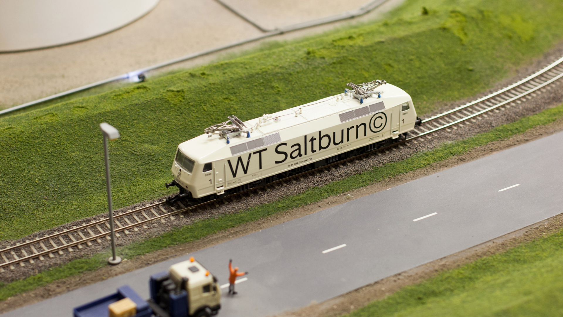
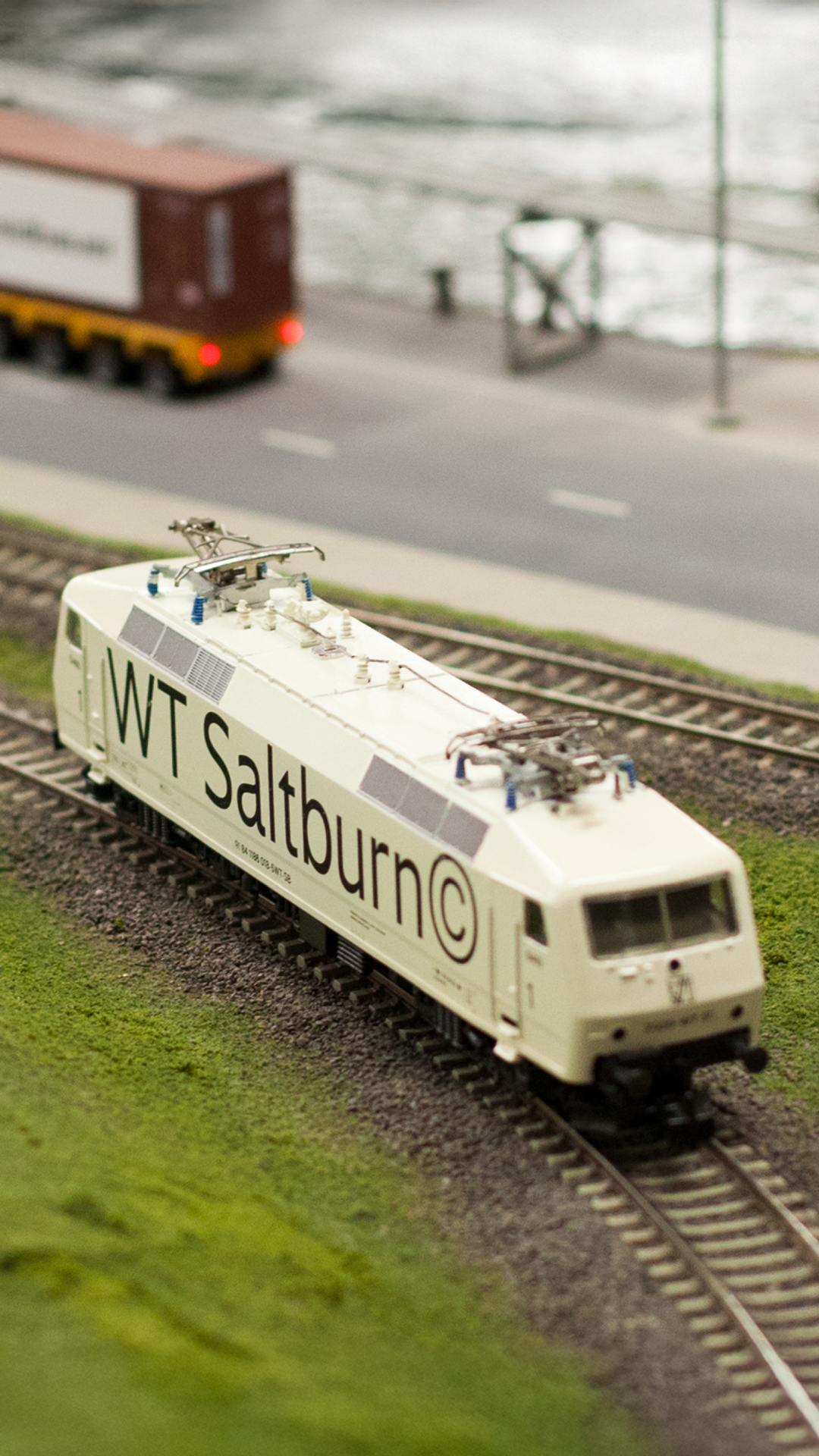
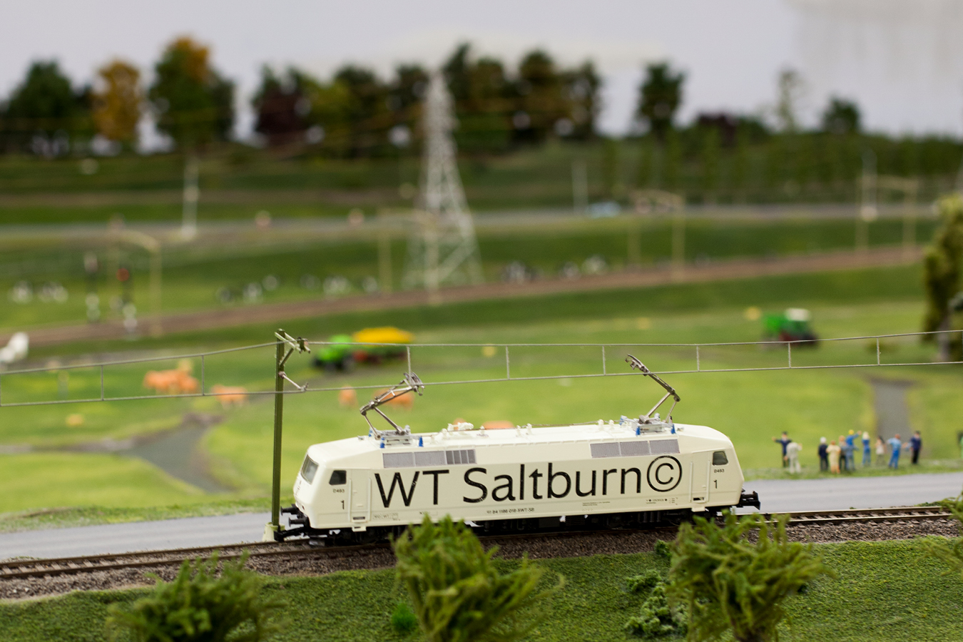
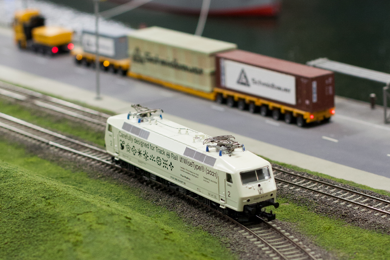
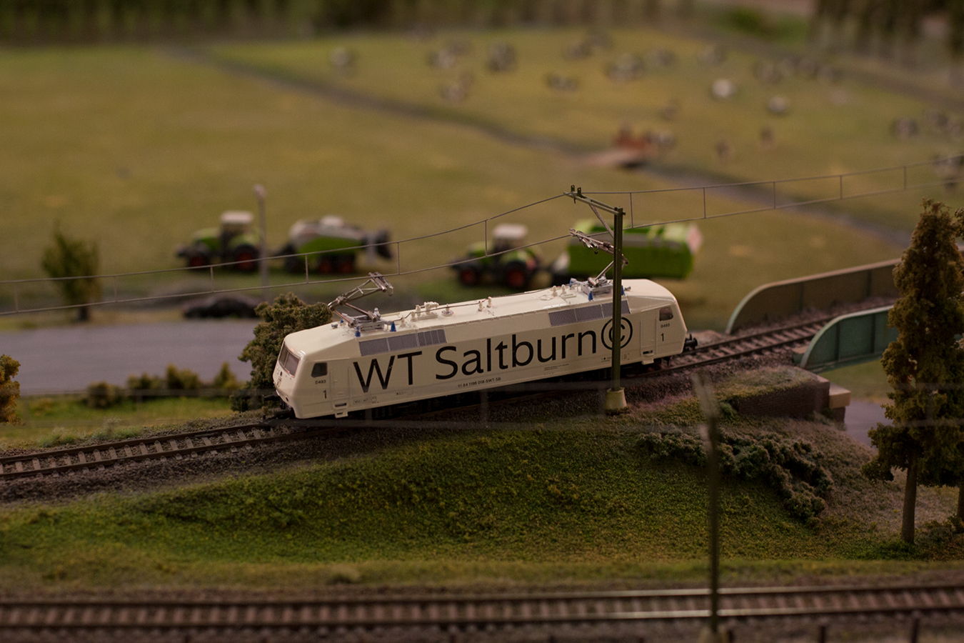
Saltburn is a railway-inspired variable sans serif, designed for track and rail. From the outset, inspiration was drawn from the British interpretation of the sans serif model and its use within transport systems. Edward Johnston's 'Underground Alphabet' (1916) and Eric Gill's subsequent 'Gill Sans' (1928) encapsulated a uniquely British take on the sans serif – one that was more humanist in tone than the geometrically pure style developing on the continent.
Living in Rotterdam and being half Dutch, I’ve always had a fondness for the Dutch National Railway, or "NS" (Nederlandse Spoorwegen). Known for its bright, pragmatic, and consistent style, the NS identity was set forth by Gert Dumbar while working for Tel Design in 1968. Initially, the NS used Adrian Frutiger's Univers typeface, but in 1995, it switched to an adaptation of Frutiger's self named 'Frutiger'. Gerard Unger, the Dutch typographic heavyweight, had been commissioned to design this adaptation specific to the requirements of the NS in cooperation with Hans van Leeuwen from Visualogik. This adaptation which had so intrigued me, was later dubbed 'NS Sans'. There’s something delightfully ironic about the Dutch crafting their national railway's identity with Swiss typefaces, as if borrowing a bit of Swiss neutrality for their own tracks – perhaps then they'd run on time!
This enthusiasm for railway typefaces inspired me to imagine Saltburn blending into the "national railway style" adopted by nationalised networks across Europe. I aimed to strike a balance between three particular railway networks: British Rail (defunct since 1997), the Dutch NS, and the Swiss Federal Railways (SBB), all of which employ a similar, neutral "house style". (Just take a look at the logo's and you’ll see what I mean.)
Saltburn was designed as a variable font from the outset. It can be classified as a humanist sans-serif due to its open counters and sharp terminals, yet it retains the character of a grotesque through its letter proportions. The default character set features a distinctive double-story 'g' and a chiselled 't' as well as more standard alternatives depending on taste. In addition to all the stylistic alternatives, Saltburn offers an extensive selection of figures, fleurons, symbols, and pictograms to enhance typographic possibilities. Its lightness of colour on the page is partly due to its high shoulders and sharp stem connections, which help max-out the counterforms. The family includes nine weights, from Thin to Heavy, with a variable version that offers customisable weight and italic axes.
The name Saltburn is inspired by Saltburn-by-the-Sea, a small seaside town in the East Riding of Yorkshire where my father grew up. The town owes much of its development to the Stockton & Darlington Railway, which connected the once-small hamlet in 1861. Additionally, Saltburn is known for its postcard-worthy funicular railway, which has been transporting passengers up and down its steep cliffs since 1884.
