Monarch Nova is a distant, hazy memory of centuries past. A rickety cart, blunted by cobblestones. Moss covered dolmens standing tall. Wind swept hills and crumbling folly's. Clay pipes and pottery wash ashore...
The design started life as Monarch – the first font I published back in 2017 based on a rough set of sketches. It was an attempt to capture the graphic design zeitgeist of the time – one which harked back nostalgically towards a mystical, bygone age. Echoes of the Arts & Crafts movement of the early 20th century, which conjured an idealised vision of the past in response to an increasingly industrialised world. Modernism is dead – craft, beauty, and ornament are our new pillars of worship!
Although the original Monarch was a little rough around the edges, it by far made up for in character, combining a unique bodge of historical pastiche to create something that felt thoroughly original in spirit. I returned to the font a few years later and worked on a fully redrawn update which was published in 2020 as ‘Monarch Nova’. The update sought to tone down some of the more clumsy aspects of the design and character to create a more harmonious and legible revision. This was aided by the help of the French type designer Margot Lévêque who assisted in the production.
More recently in 2024, I returned to the font once again to refine and expand on the design. Unsurprisingly, this led me down the inevitable path of redrawing everything all over again... Beside the more general refinements to the letterforms, the character-set was expanded and some of the more unique qualities of the original Monarch were brought back into the most recent update on a variety of stylistic sets. On top of that, the new update offers a range of alternative glyph sets to either tone down or crank up the character; formal pantaloons or silk breeches – whichever mood you're in.
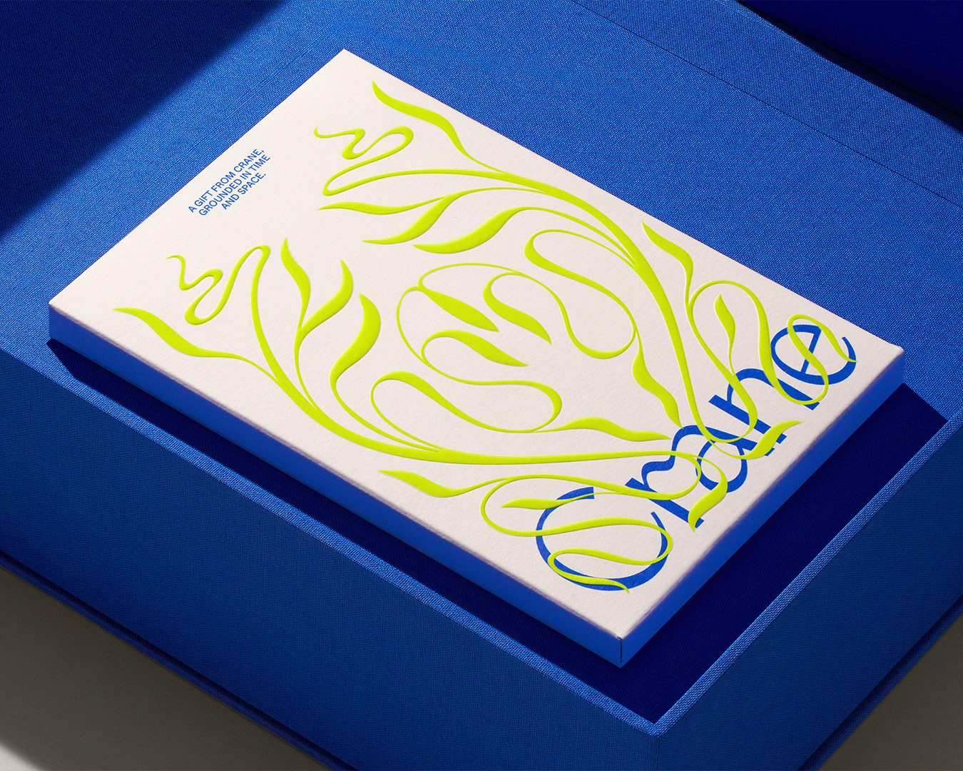
Monarch Nova’s strokes are clean, sharp and un-serifed. The font has a tall x-height, wide open counters, and features an array of characteristics including flourished cross-bars and various calligraphic cues. It’s simultaneously flamboyant yet rational in design. The font works best at display sizes due to its delicate nature and stroke contrast but also serves well in running text. Legibility can be further improved by enabling the more conventional stylistic sets.