Punchcutters work absorbed in thought. Their dexterous fingers steady, their minds in a trance — gracefully guiding their gravers with minuscule movements. Perhaps it’s not too far-fetched to imagine our punchcutter in question; the Parisian Claude Garamond (1480–1561) adrift in reverie, mulling over the various widths of letterforms. He was a man of the Renaissance, a humanist at heart. The pursuit of divine proportion was one of his guiding principles. And yet carving away at his workshop on Rue Saint-Jacques, with the distant clatter of carts, and the creaking of presses in action, could he have conceived of a type cut of equal width? Some sort of monospaced Garamond? a... Garamono?
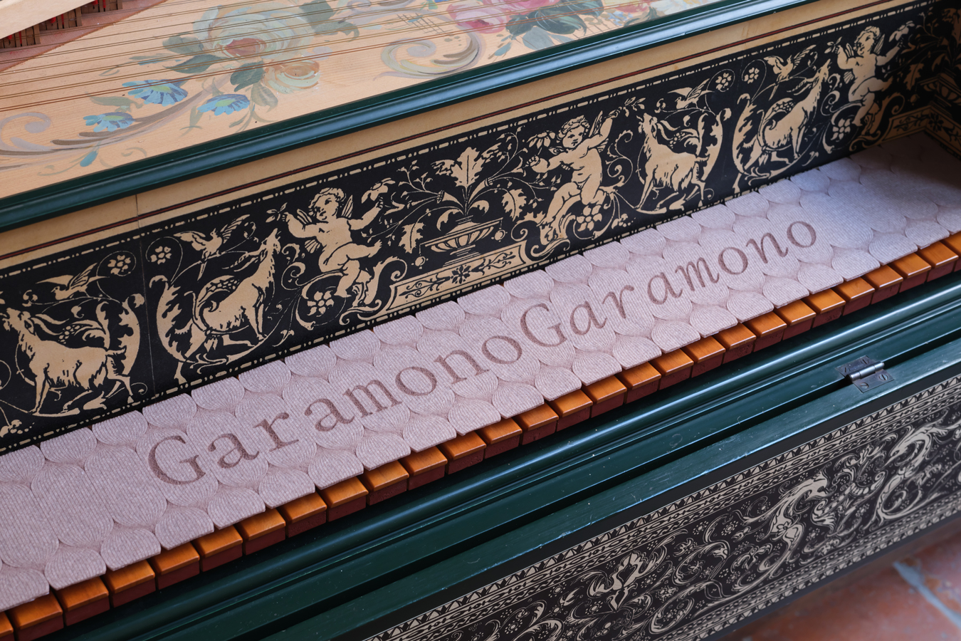
Maybe he did, maybe he didn’t. The fact remains that Claude never attempted such barbarity. It would take nearly six centuries for this all too obvious cocktail of ideas to finally coalesce. The result is the expertly named Garamono — a scathing polemic on Renaissance proportion. Out with the carefully harmonised rhythm. Its various letter-widths have been skilfully contorted into a fixed width system. Revisionist history is here to stay!
The family comes in two styles: Regular and Italic — both with extensive character sets. The design plays with the fixed width structure to include a range of swashes, ligatures, and final forms at double or triple widths. It still maintains the monospaced framework but helps provide a little more wiggle-room for a nice decorative touch.
Garamono comes from the sharp mind and eye of Ishar Hawkins — a graphic and type designer who’s humour permeates every project touches. The design started out in 2021 and was gradually developed over these past years.